CLASS-4
BAR GRAPH - PICTOGRAPH
BAR GRAPH -
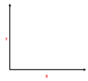
A bar graph is a type of chart that uses bars to represent data. The bars are usually rectangular in shape, and their length or height represents the quantity or value being measured. The x-axis represents the categories or groups being compared, while the y-axis represents the scale or measurement.
Bar graphs are commonly used to compare data sets, show trends over time, or display survey results. They are easy to read and interpret, making them a popular choice for presenting data in a visual format. Bar graphs can be created using a variety of software applications, including Microsoft Excel, Google Sheets, and online graphing tools.
A bar graph is a type of chart that uses rectangular bars to represent and compare data. The length or height of each bar represents the quantity or value of the data it represents. The bars are usually arranged horizontally or vertically, and the data can be displayed in different colors to make it easier to read.
Bar graphs are commonly used to show the frequency distribution of categorical or numerical data. They are especially useful when comparing data from different categories or groups, and they can be easily interpreted by people with little or no statistical training.
Bar graphs can also be used to display trends over time, such as changes in sales or revenue over a period of months or years. In this case, the bars would be arranged chronologically, with each bar representing the data for a specific time period.
Overall, bar graphs are a simple but effective way to visualize data and communicate information to a wide audience.
A bar graph is a type of graph used to represent data using rectangular bars of equal width. The length of each bar is proportional to the value of the data it represents. The bars are arranged horizontally or vertically, with the axis representing the data categories.
Bar graphs are commonly used to compare data across different categories or time periods. They are also useful for showing changes in data over time, and for illustrating the composition of data in different categories.
For example, a bar graph might be used to show the sales of different products over a period of time, with each product represented by a different bar. The length of each bar would represent the sales volume for that product, and the bars could be arranged horizontally to show the data over time, or vertically to compare the sales of different products.
Bar graphs are easy to read and interpret, making them a popular choice for presenting data in reports, presentations, and other forms of communication.
A bar graph, also known as a bar chart, is a graphical representation of data using rectangular bars of different lengths or heights. The length or height of each bar represents the magnitude or frequency of the data being displayed. Bar graphs are commonly used to compare data across different categories or to show changes in data over time.
Bar graphs can be drawn horizontally or vertically, depending on the nature of the data being presented. In a vertical bar graph, the bars are positioned along the y-axis, while the x-axis represents the different categories or groups being compared. In a horizontal bar graph, the bars are positioned along the x-axis, while the y-axis represents the different categories or groups being compared.
Bar graphs are a useful tool for visualizing data and are commonly used in business, finance, economics, and other fields to present statistical data and make informed decisions.
Bar graphs are the pictorial representation of data in the form of vertical or horizontal rectangular bars, with equal spacing between them. The length of the bar depends upon the number it represents.
Properties Of Bar-Graph -
Ø Bars may be vertical or horizontal - Horizontal bar graph and Vertical or Column bar graph.
Ø Bars are of uniform width throughout.
Ø The gap between two bars is uniform throughout.
Ø Bar graph has a title. It tells us what it represents.
Ø The height or length of a bar tells us the value (in numbers).
Ø A graph has two axes – x axis and y axis.


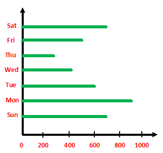
Make the table and then answer the following questions in full sentences.
DAY SALE (in kg)
Sunday 700
Monday 900
Tuesday 600
Wednesday 400
Thursday 300
Friday 500
Saturday 700
1. Which day has the maximum sale?
Ans: Monday has the maximum sale.
2. Which day has the least sale?
Ans: Thursday has the least sale.
3. Calculate the total sale of the week.
Ans:
DAY SALE (in kg)
Sunday 700
Monday 900
Tuesday 600
Wednesday 400
Thursday 300
Friday 500
Saturday + 700
Total sale 4100
The total sale of the week is 4,100 kg.
1. Which two days have the same sale?
Ans: Saturday and Sunday are the two days that have the same sale (700 kg).
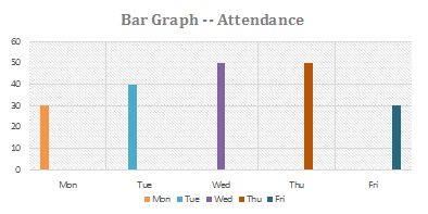
The attendance of a particular class of 50 students for five days is as per the bar graph given
below:

Make the table and then answer the following questions in full sentences.
DAY No. of students present
MONDAY 30
TUESDAY 40
WEDNESDAY 50
THURSDAY 50
FRIDAY 30
1. On which two days was the attendance the maximum?
Ans: The two days on which the attendance was the maximum were Wednesday and Thursday (50).
2. On which days maximum students were absent?
Ans: Maximum students were absent on Monday and Friday. (50 – 30 = 20 students were absent)
3. What is the difference in the maximum and minimum attendance?
Ans: The difference in the maximum and minimum attendance is 50 – 30 = 20.