CLASS-4
INTRODUCTION OF PICTOGRAPH
INTRODUCTION OF PICTOGRAPH -
A pictograph is a visual representation of data using symbols or pictures to represent quantities or information. It is a type of graph that uses pictures or symbols to convey meaning, rather than numerical or textual data. Pictographs have been used throughout history to communicate information in a simple and easily understood way, and they are still used today in various contexts, such as in road signs, instructional materials, and infographics.
Pictographs can be used to represent many different types of data, such as the number of people in a group, the amount of rainfall in a given area, or the types of animals found in a particular region. The symbols used in a pictograph can be simple or complex, depending on the complexity of the data being represented.
One advantage of using pictographs is that they can be easily understood by people who may not be able to read or understand numerical or textual data. However, pictographs can also be misleading if they are not carefully designed and interpreted, and they may not be suitable for representing complex data sets.
A pictograph is a visual representation of data or information using pictures or symbols. It is a form of data visualization that has been used throughout history to communicate information in a simple and easy-to-understand way. Pictographs can be found in many different contexts, from ancient cave paintings to modern infographics and data charts. The symbols used in pictographs can be simple or complex, and can represent a wide range of concepts and ideas. Some examples of pictographs include maps, charts, and graphs, as well as the use of emojis and other symbols in digital communication. Pictographs are often used to make data more engaging and easier to understand, especially for people who may have difficulty reading or interpreting numerical data. For example, a pictograph might use pictures of apples to represent the number of apples sold at a market each day, with each picture representing a certain number of apples. Pictographs have been used throughout history in various forms, including ancient cave paintings and hieroglyphics, and continue to be used today in many contexts, such as in infographics and data visualization.
The information we collect about various things and people is known as data.
The presentation of collected information in an arranged and sorted way is known as data handling.
We often need to find things such as:
· The population of a town
· Number of students in a school
· Sales of a particular product during a week
We can represent data by pictograph, bar graph, tally marks, line graph, pie chart, etc.
PICTOGRAPH OR PICTURE GRAPH -
Pictograph is the representation of the given data by using symbols or pictures.
Each image in the pictograph represents certain things. The pictograph is extremely easy to understand, and it is one of the simplest ways to represent the statistical data.
In the pictograph, we use a key, which denotes the value of the symbol. While using symbols or images, all the symbols should be of the same size.
How to Make a Pictograph?
The different steps to make a pictograph are given below:
Step 1: Collect the Data
Step 2: Select the Symbol or Images Step 3: Assign a Key
Step 4: Draw the Pictograph
Step 5: Review the Data and Pictograph
Pictograph Examples -
Let us consider an example, which will tell us how to interpret data using pictographs.
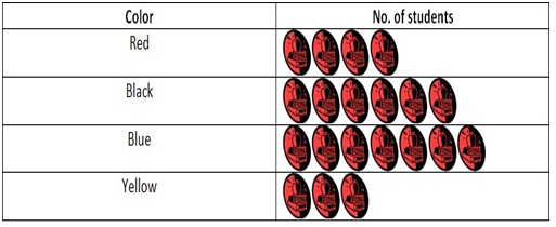
EXAMPLE 1: In the given figure, the data of 100 students has been collected, who like different colors. The data given was as follows:


COLOR NUMBER OF STUDENTS
Red 4 X 5 = 20 students
Black 6 X 5 = 30 students
Blue 7 X 5 = 35 students
Yellow 3 X 5 = 15 students
EXPLANATION:-
As we can see that the given data becomes more visually appealing and easy to interpret. Suppose, a question was asked, what is the difference between the students who like blue and red colors? By seeing the pictograph, we can directly interpret that there is a difference of 3 STUDENT and 1 STUDENT is equal to 5 students. So, the difference is of 15 students.