CLASS-6
DATA HANDLING - BAR GRAPH
Bar Graph -
A simple bar graph is used to represent data involving only one variable. In a simple bar graph, we make bars of equal width but variable length. It is used to
Bar Graph is another method of representing data visually. In the case of bar graph or bar diagram, Bars of uniform width are drawn horizontally or vertically with equal spacing between them and then the length of each bar represents the given number.
Bar graphs or bar diagrams are helpful in representing the data visually. In bar graphs or bar diagrams, bars of equal width are drawn horizontally or vertically with equal spacing between them.
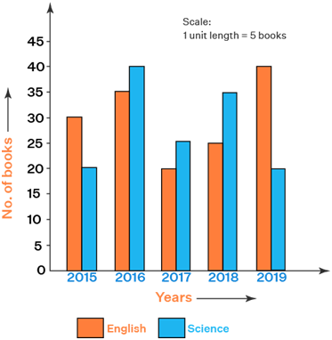
The length of each bar represents the required information. Therefore, the longer of the bar, greater value of data. Choosing an appropriate scale for a bar graph is important. Scale means the number used to represent one unit length of a bar.
Creating a bar graph is a simple and effective way to visually represent data. Here's a step-by-step guide on how to make a basic bar graph:-
Step 1:- Gather Your Data Collect the data you want to represent in the bar graph. You should have a set of categories or labels, along with corresponding numerical values for each category.
Step 2:- Choose the Right Tool There are various tools you can use to create bar graphs, ranging from spreadsheet software like Microsoft Excel or Google Sheets to more advanced data visualization tools like Python's Matplotlib library or online graphing tools. Choose the tool that best suits your needs and familiarity.
For the purpose of this example, I'll explain how to create a bar graph using Microsoft Excel:
Step 3:- Open Excel and Enter Data
- Open a new Excel spreadsheet.
- Label one column with the categories or labels and another column with the corresponding numerical values.
Step 4:- Select Data and Insert Bar Graph
- Highlight the data you want to graph, including both the category labels and numerical values.
- Go to the "Insert" tab on the Excel ribbon.
- Click on the "Bar Chart" button and select the type of bar graph you want (e.g., clustered bar, stacked bar, etc.).
Step 5:- Customize Your Graph Once you've inserted the bar graph, you can customize it to make it more informative and visually appealing:
- Axis Labels:- Make sure your axes are labeled clearly, including units if applicable.
- Title:- Add a title to your graph to explain what it represents.
- Legend:- If you have multiple data series, add a legend to clarify which color represents which category.
- Color and Style:- Customize the colors of the bars, axes, and other elements to match your preference or to adhere to any branding guidelines.
- Data Labels:- Include data labels on top of or within the bars to display the exact values.
- Gridlines:- Add gridlines to help viewers better interpret the values.
Step 6:- Save and Share Once you're satisfied with your bar graph, save your Excel file. You can then share the file with others, copy and paste the graph into a presentation or document, or export the graph in image format (e.g., PNG, JPEG) if needed.
Remember that the process might vary slightly depending on the tool you're using, but the basic principles of creating a bar graph remain similar across different platforms.
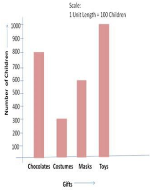
For example, the scale for the bar graph shown here is 1 unit length = 100 children.
A simple bar graph is used to represent data involving only one variable. In a simple bar graph, we make bars of equal width but variable length. It is used to compare two or more relative sizes.
When the grouped data are represented vertically in a graph or chart with the help of bars, then such graphs are called vertical bar graphs. The data represented here is along the y- axis of the graph, and the height of the bars gives the values.
When the grouped data are represented horizontally in a chart with the help of bars, then such graphs are called horizontal bar graphs. The data represented here is along the x-axis of the graph, and the length of the bars gives the values.

