CLASS-6
DATA HANDLING - PIE CHART
PIE CHART -
Pie Chart-
A pie chart is a pictorial representation of data in the form of a circular chart or pie where the slices of the pie show the size of the data. A list of numerical variables along with categorical variables is needed to represent data in the form of a pie chart. The arc length of each slice and consequently the area and central angle it forms in a pie chart is proportional to the quantity it represents.
What is Pie Chart?-
A pie chart is a type of a chart that visually displays data in a circular graph. It is one of the most commonly used graphs to represent data using the attributes of circle, sphere, and angular data to represent real-world information. The shape of a pie chart is circular where the pie represents the whole data and the slice out of the pie represents the parts of the data and records it discretely.
Pie Chart Definition-
A pie chart is a type of graph that records data in a circular manner that is further divided into sectors for representing the data of that particular part out of the whole part. Each of these sectors or slices represents the proportionate part of the whole. Pie charts, also commonly known as pie diagrams help in interpreting and representing the data more clearly. It is also used to compare the given data.
A pie chart is a circular chart that is divided into slices to represent numerical proportions. Each slice represents a portion of the whole, and the size of each slice is proportional to the quantity it represents. Pie charts are commonly used to show the distribution of a set of data points as parts of a whole. Here's how to create a pie chart:
Step 1:- Gather Your Data Collect the data you want to represent in the pie chart. This data should consist of categories or labels and their corresponding numerical values. Make sure the values represent parts of a whole, adding up to 100% or 360 degrees (the total circle).
Step 2:- Choose a Tool Just like with bar graphs, there are various tools you can use to create pie charts. Spreadsheet software like Microsoft Excel or Google Sheets, data visualization libraries like Matplotlib in Python, and online graphing tools are popular choices.
Step 3:- Enter Data and Create Pie Chart Here's how to create a simple pie chart using Microsoft Excel:
- Open a new Excel spreadsheet.
- Label one column with the categories or labels and another column with the corresponding numerical values.
- Highlight the data you want to use for the pie chart.
- Go to the "Insert" tab on the Excel ribbon.
- Click on the "Pie Chart" button and select the type of pie chart you want (e.g., 2D pie, 3D pie).
Step 4:- Customize Your Chart After creating the pie chart, you can customize it to make it more informative and visually appealing:
- Labels:- Add labels to each slice, showing the category name and percentage or value.
- Legend:- Include a legend to explain what each slice represents.
- Exploded Slices:- If you want to emphasize a particular slice, you can "explode" it by pulling it out slightly.
- Colors:- Customize the colors of each slice to differentiate them.
- Title:- Add a title to your chart to explain its purpose.
Step 5:- Save and Share Once you're satisfied with your pie chart, save your Excel file. You can share the file with others, copy and paste the chart into presentations or documents, or export the chart as an image if needed.
Keep in mind that while pie charts are useful for showing parts of a whole, they can become difficult to interpret when there are too many slices or when the differences in values are subtle. In such cases, other types of charts, like bar charts or stacked bar charts, might be more appropriate.
Pie Chart Example-
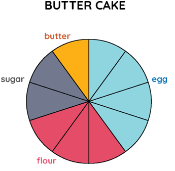
Let us look at the following example of the following pie chart that represents the ingredients used to prepare a butter cake.

Example:- The whole pie represents a value of 100. It is divided into 10 slices or sectors. The various colors represent the ingredients used to prepare the cake. What would be the exact quantity of each of the ingredients represented in specific colors in the following pie chart?
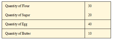
Solution:- As we can see, the pie is divided into 10 slices or sectors. To calculate the exact amount of ingredients that are added to the cake, we divide the whole sector's value, i.e., 100 by the number of sectors. So, 100 ÷ 10 = 10. Hence, looking at the color divisions made in the pie chart we can conclude that:
