CLASS-6
PIE CHART - USE OF PIE CHART
PIE CHART - USE OF PIE CHART -
Uses of Pie Chart -
Whenever some data has to be represented visually as a fractional part of a whole, we use pie charts. It is used to compare the data and see why one is smaller/greater than the other.
Therefore, when we are dealing with a limited number of buckets and discrete data sets, it’s better to use a pie chart. Listed below are a few uses of a pie chart:
· In a business, it is used to compare the growth areas such as profit and loss.
· In school, pie charts are used to show the time allotted to each section, the grades of students in a form of percentages, etc.
· Pie charts are used in comparing the relative size of data of people owning the same vehicles, similar houses, etc.
· They are used to represent the marketing and sales data for the comparison of brands.Steps to Construct Pie Chart
We use the following steps to construct a pie chart and using the above-mentioned formulas, we can calculate the data.
· Step 1:- Write all the data into a table and add up all the values to get a total.
· Step 2:- To find the values in the form of a percentage divide each value by the total and multiply by 100.
· Step 3:- To find how many degrees for each pie sector we need, we take a full circle of 360° and use the formula:-
(Frequency/Total Frequency) × 360°
· Step 4:- Once all the degrees for creating a pie chart are calculated, draw a circle (pie chart) using the calculated measurements with the help of a protractor.
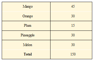
Example: Construct a pie chart to visually display the favorite fruits of the students in a class based on the given data:-
Mango - 45;
Orange - 30;
Plum - 15;
Pineapple - 30;
Melon - 30
Ans.)
Step 1:- Create a table with the values and get the total.

Step 2:- Find the percentage of each value:
Mango = (45/150) × 100 = 30%
Orange = (30/150) × 100 = 20%
Plum = (15/150) × 100 = 10%
Pineapple = (30/150) × 100 = 20%
Melon = (30/150) × 100 = 20%
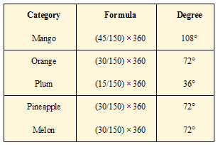
Step 3:- Finding the degree of each pie sector using the formula:-
(Given data/Total Value of data) × 360°

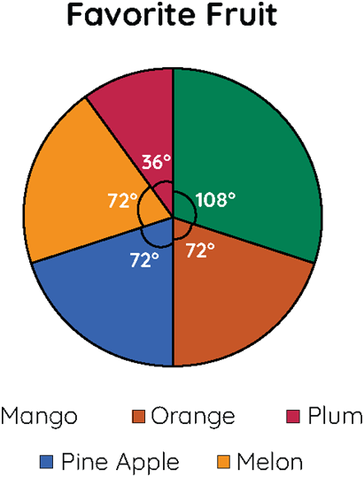
With all the above degrees, with the help of a protractor draw a pie chart. Thus, the pie chart looks like this:-

Interpreting Pie Chart -
To read or interpret a pie chart, we see if the given chart is given in percentages or without any value. If it is given in percentages, the conversion is made accordingly and interpreted accordingly. Let us look at an example to understand this better.